Italian football shirt designs have always been a cut above, with Serie A kits from the 90’s perhaps the most revered and sought after shirts on the market. But whilst collectors and fans alike grasp after vintage Juventus and Inter shirts, Serie B kits are often overlooked.
Given the host of inventive and exciting kits the league has produced throughout the years, this is a crying shame. This article – in an attempt to rectify these injustices – aims to distill the last 90+ years of Serie B kits into a list of 10 of the most memorable.
Serie A lists like this are as common as a fake Gabriel Batistuta Fiorentina shirt on eBay, so I have tried to avoid including kits from the giants such as Juventus and Milan that have temporarily found themselves in the glorious league of Serie B. Many of these shirts are very rare but will pop up from time to time – so keep an eye out on the relevant sites.
Now, to the list.
10. Delfino Pescara – ‘by Luigi’ Training Shirt 2020 (Errea)

Although it may be controversial to include a-never-worn-during-an-actual-Serie-B-game training shirt, this one from Pescara – released last season – had to make the cut.
Italy were the first European country to be hit during the COVID-19 pandemic, and they were hit hard. Pescara decided to run a kit designing competition to ‘contribute to bringing colour to these difficult times’ – with six year old Luigi D’Agostino winning the competition with this sterling effort. The dolphin (representative of I Delfini, who call the coast of the Adriatico home) takes centre stage and the rainbow was utilized as a symbol of hope and peace in these difficult times.
The loud and garish design is enough to solidify this as a shirt that won’t be forgotten in a hurry, but the real legacy of this shirt is the economic repercussions. The shirt ‘blew up’ online, with worldwide sales going through the roof. A large amount of the proceeds were donated to not only Italian charities, but even to the NHS in the UK, helping to care for those with COVID-19. The shirt also brought Pescara ‘buona fortuna’, with them escaping the drop to Serie C by winning a penalty shootout in the relegation playout in August
9. Alzano Virescit Home 1999/00 (Virma)

Alzano Virescit only competed in Serie B once in their entire history – and they made sure to mark this momentous occasion with a lovely kit.
Virma still exist as a sportswear company but don’t seem to manufacture kits anymore, which is a real shame. The black and white checkerboard pattern is unique and gives the shirt a lovely retro feel. I always love when a sponsor can be incorporated into a shirt without ruining the bespoke patterns, and this the sponsor is housed perfectly in the centre – aided by a cracking effect.
The striped details on the sleeve and reflective star pattern (which needs to be seen in person to appreciate fully) completes a distinctive shirt. Although their season ended in relegation, at least they managed to do it style. This kit is special to fans of this now defunct club – you can even download the squad and jersey for the latest Pro Evolution Soccer videogame.
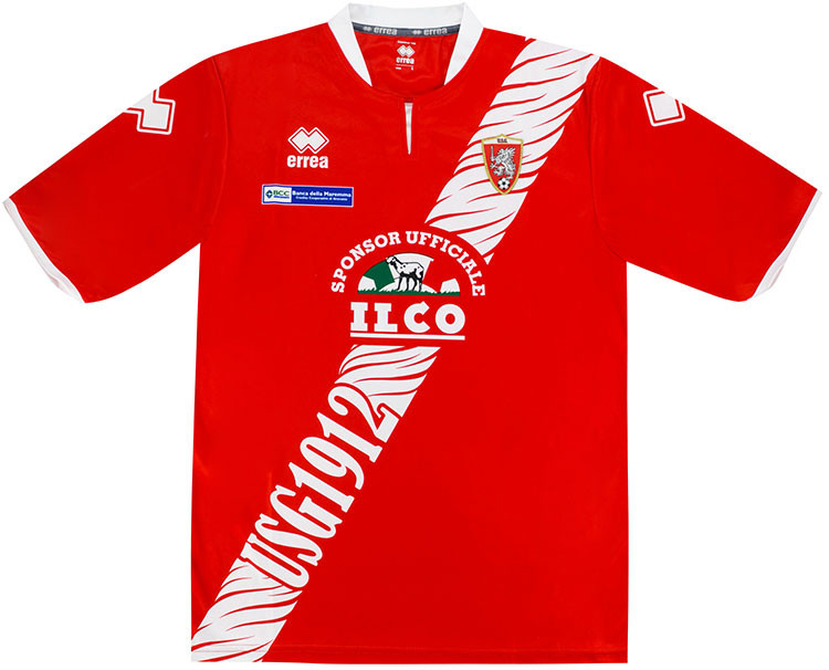
8. Grosseto Home 2012/13 (Errea)

Grosseto hail from Tuscany and traditionally yo-yo between Serie C and D. However, they endured a glory period between 2007-2013 where they competed in Serie B for six consecutive years. The 2012/13 shirt may have been worn in a season they were relegated, but that detracts nothing from the design.
The deep red is the traditional colour of i Grifoni, and the shirt is dominated by the now iconic zebra print sash. I am pretty sure zebras are not native to Tuscany, but frankly, who cares when the design works so well? The sash is designed to seamlessly integrate a rather large meat produce sponsor, the team badge and the club initials. Crucially, in a stylistic feature that is now lost in current kit design, the sash is also applied on the back of the shirt. Perfect.
7. Empoli Calcio 1983/84 Home (Adidas)

Sammontana have been one of the quintessential calcio sponsors throughout the years, taking pride of place on many celebrated Fiorentina kits throughout the decades. Despite being known for their links with La Viola, Sammontana was actually established in the provincial town of Empoli (about 20 km from Firenze) and has also adorned many lesser known kits for Gli Azzurri.
This Adidas kit from 1983/84 is a perfect example of what made 80’s football shirts great. The dark blue with white pinstripes is a stylish look when paired with the white V neck and contrasting stripes on the sleeves. The Adidas Trefoil logo and worded sponsor (the famous smiling ice cream graphic would not been seen on Empoli kits until the 90’s) means this a minimalist but classy kit.
Empoli managed to avoid relegation by one point in this season, meaning kits as good as this would continue to be displayed in Serie B until Empoli were promoted to Serie A in 1985/86.
6. Lucchese Home 1996/97 (Errea)

Just look at it. This shirt could only be more 90s if it was worn by James Richardson on Football Italia. The 1990s, in my opinion, is the greatest decade for kit design in history – and this might be the most stereotypical 90’s looking kit on this list.
The large lion graphic and the team name dominates the shirt, creating a 3D-like-effect against the classic red and black stripes of the Rossoneri. The name is again emblazoned across the sleeve in a ringed pattern, and the manufacturers logo, sponsor and club badge is bunched close together to give the rest of the design maximum impact. It is finished off by one of the best reflective patterning I’ve seen on a shirt.
If this was worn today by a high profile team it would be heralded as a future classic, but for now it remains a relatively unknown shirt worn by a small Tuscan team in Serie B.
5. Cremonese 1992/93 (Uhlsport)

Eagle eyed fans of the Anglo-Italian cup will instantly recognise this classic, with Cremonese donning this shirt when lifting the trophy at Wembley following their victory over Derby County. Red and grey stripes are not a common combination, but these shades complement each other perfectly.
Uhlsport are another manufacturer that now seem to be absent from the kit game, but they produced a host of brilliant shirts in the 90’s, including Brescia Home 1991/92 and Fiorentina Home 1994/95. None are better than this example though. It is simple, clean and iconic and coincides with a high point in the club’s history – the 92/93 season not only saw victory in the Anglo-Italian cup, but also ended with promotion to Serie A.
4. Hellas Verona Home 95/96 (Errea)

As you will know by now, due to the previous (and future) list entries, I’d do anything for a kit with an oversized graphic.
Errea in particular seem to be experts at this design type, and I love this from i Gialloblu. It oozes pure class. The blue on this kit is a darker shade than usually seen on Hellas kits, and I think this gives it a more pleasing contrast to the bright yellow. The extremely large sublimated club badge in the middle of the shirt containing the mastiffs of Verona is housed between two block pattens of yellow, and the famous Italian pasta brand Rana is also displayed in large letters so not to be overshadowed.
Just in case you forget which team this shirt belong too, the club badge is also present on the left sleeve, which is an Italian tradition of yesteryear I really like (see Napoli 1987/88 and Juventus 1998/99 for other excellent non-Serie B examples).
3. Palermo Home 94/95 (ABM)

There had to be a Palermo kit in this countdown. The Rosanero colours are one of the most recognisable in world football and this ABM kit from 94/95 is a perfect example of why the Sicilian team’s kits are hailed all around the globe.
I love that Palermo are sponsored by the City’s institutional body as it gives real local character to the shirt. I could have easily gone for the arguably more famous (and readily available) 96-99 Kappa home shirt, but the deeper shade of pink, superior club badge and ABM collar pattern means the 94/95 kit edges it for me. Palermo finished mid-table with this kit, whereas they were relegated in the 1996/97 season, firmly cementing the ABM shirt as Palermo’s best ever in Serie B.
2. Lazio Home 1982/83 (Ennerre)

In 1980, Lazio found themselves relegated to Serie B for only the second time in their history due to a betting scandal. Despite my promise not to include large clubs in this list, the kit designed for them in the 1982/83 season by renowned kit maker Nicola Raccuglia and his company Ennerre has to be involved.
This legendary design was a drastic departure from the plain blue shirts that came previously. The shirt has the traditional blue and white, but utilises a block pattern to house the extremely large eagle (the symbol of Lazio) that stretches from the sleeve to sleeve.
The iconic NR logo, memorable sponsor and lack of club badge (which would begin to appear on shirts from the following season) means this is one of the most famous shirts from the 80’s, regardless of the league. Lazio was also inspired to attain promotion back to Serie A this year, cementing it as an important shirt in the club’s legacy. The design was brought back in the 2018/19 season, with much rejoice from the football hipsters around the globe.
1. Castel di Sangro Home 1996/97 (Penne)

Castel di Sangro hail from a city of only 5,500 residents in the province of L’Aquila and were immortalised in one of the best sports books ever written – the Joe McGinnis masterpiece ‘The Miracle of Castel Di Sangro’.
It truly was a wonder that this tiny club from Abruzzo (now in the sixth level of Italian football, two leagues below Serie D) managed to reach the heady heights of Serie B for two seasons. Even more astounding, however, is the quality of their first ever kit worn in the league.
Relatively unknown and now extinct manufacturer Penne (yes, the logo is of a humanised pasta) pulled out all the stops to create a shirt that is sought after not only due to its legacy, but also due to aesthetics.
Castel di Sangro is wedged in a valley in the Appennini mountains, and this is signified by the jagged mountaintop design that dominates not only the main body of the shirt, but the sleeves as well. The now iconic Soviet Jeans sponsor, large club badge and reflective Penne logo throughout the shirt make this a true holy grail of shirt collecting, and it is by far the best and most iconic shirt in Serie B history.
Words by: Jake Mills

